Unit 1 Critical Reflection and Context
Critical Reflections and context

Sketchbook pages containing cut outs of tracings taken from casts of objects.
I began Unit 1 by taking castings of parts of furniture and objects that once belonged to a family member who passed away. The impression in the cast a form of print in itself. I then took a rubbing of the imprint onto tracing paper with a litho crayon to then expose onto a silk screen. The notion being that, in reducing of information each time as the resulting image became further away from the object, it was taking on its own ghostly form, reminiscent of blurring memories and of time passing.
At the same time I was screen printing grids, overlapping layers of hand drawn lines and squares. I tried combining the two by layering the images from the tracing on top of the grids.

A selection of A3 and A4 silkscreen prints on Fabriano paper and one of the silkscreens with cut outs that I created my images from.
However, the static and flat nature of screen printing meant that the resulting prints did not illustrate this in the way I hoped they would. They became almost too abstract whilst being too literal all at the same time. I believe there is still something to be explored with grids, tracings and castings. As I would like there to be a more cohesive duality between the between the physicality of the objects that I am studying and how they are illustrated in my image making, I can see that with further experimentation they could be woven together.

A selection of A4 and A3 screen prints on Fabriano paper
Cornelia Parker
I was lead to Cornelia Parker’s work and in particular Stolen Thunder Tarnish from Charles I’s Spurs 1998 where she uses the tarnish mark left on a handkerchief after polishing silver. In a conversation with David Campany when discussing these works she says, ‘I was simultaneously taking an impression of an object, gathering a silver trace, and rubbing away a shadow…” David Campany & Cornelia Parker in conversation. Through displaying a subtle rubbing of an object with an intriguing title, Parker is able to create a sense of physical, meaning and dimension to a piece that is otherwise abstract and 2 dimensional.

My image of Stolen Thunder Tarnish from Charles I’s Spurs 1998, taken at Tate Britain on 17.12.22
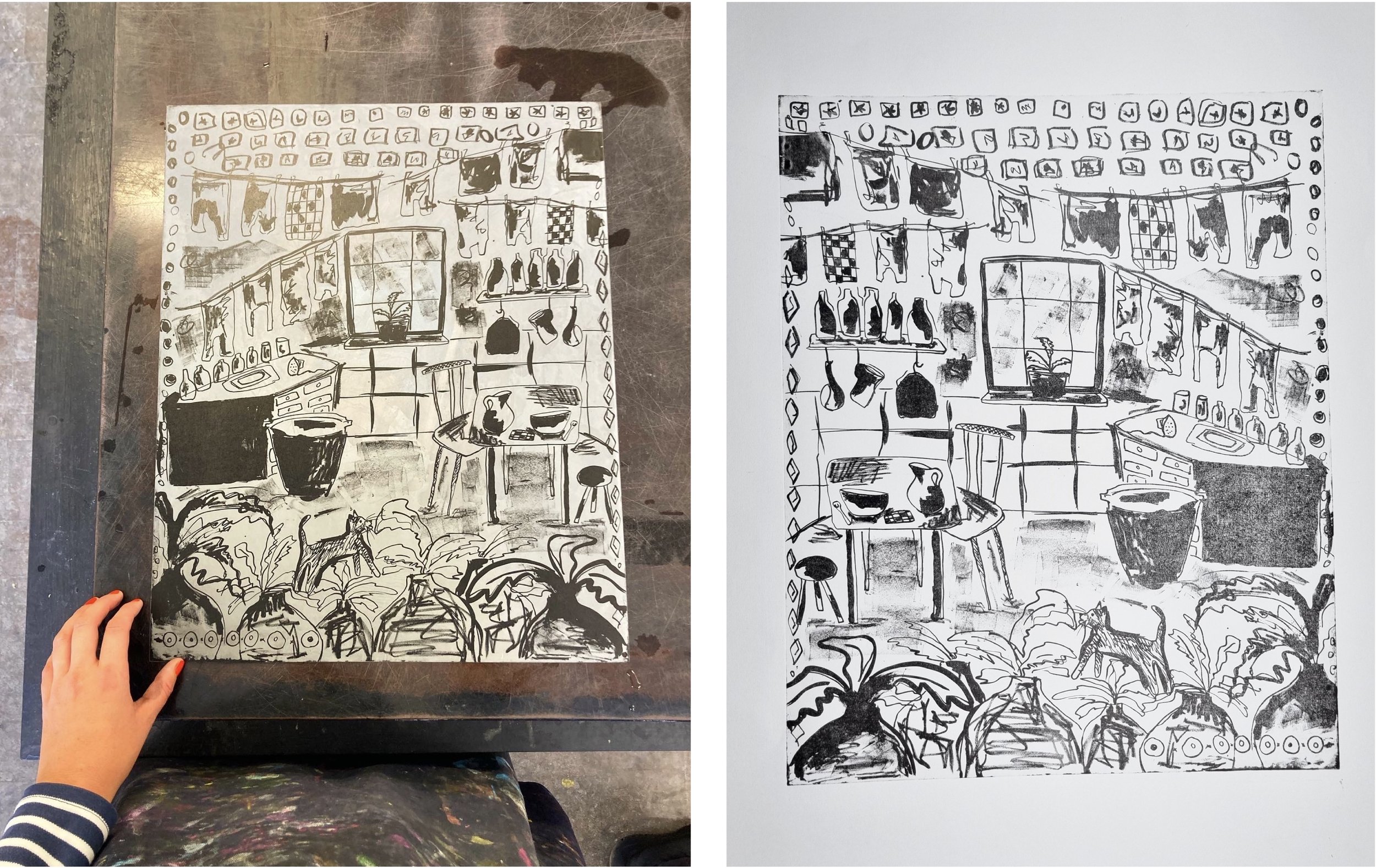
Zinc lithograph plate and lithograph print 40 X 52 CM
The above image is my zinc lithograph plate from our lithography induction. After finishing our inductions I had only been working independently in silkscreen printing, making grids and also using some of the imagery from the above lithograph print to make to make a multi layered screen print.
However, I wanted to incorporate more fluid and spontaneous drawing and mark making within my printmaking. My intention was to create more organic imagery. I decided to get a large zinc plate and experiment with using some inks and washes.

First image: Zinc plate with drawings using liquid drawing ink, dip pens and brushes
Second image: Zinc lithograph print on Fabriano paper, 40 X 52 CM
I tried sectioning off the plate and drawing individual scenes quickly into each square using a combination of litho crayons and ink washes. After having printed a few times to build up the image, I took the time to practise erasing and correction techniques on areas of the plate that had smudged or where the intended lines hadn’t printed. Although the image was rushed and didn’t feel like an accomplished piece, it gave me a thirst to continue working in lithography. I thoroughly enjoyed the process of it and how the fluid lines translated well through the print. The nature of having to commit to your line I found beneficial in freeing insecurities about mark making.
It was around this time that we had a book binding class with Clare Bryan. Inspired by some of the techniques that she showed us, I decided to cut up some of my test prints that were on newsprint into the sections and make them into small flip books within my sketchbook.
Sketchbook pages with booklet of lithograph prints on newsprint paper.
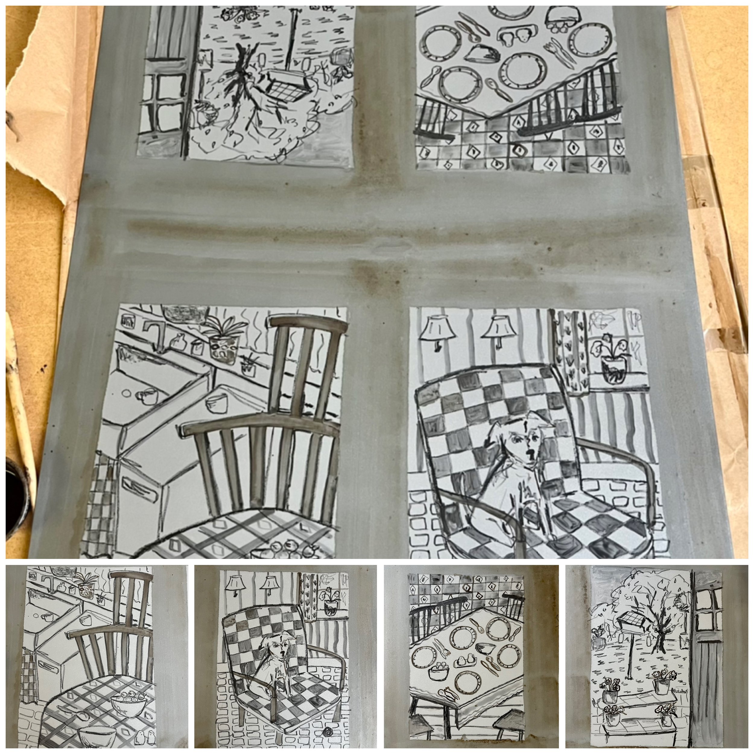
I then went on to work on another zinc lithograph plate. But after printing it and alongside the cut up images of the piece above I decided that I needed to adjust the perspective of my imagery. Printing full domestic scenes such as my piece below, If only I could ask you more questions, 2022 printed on paper big enough to give it a traditionally large border left the images feeling incomplete and also trapped. The pretence of the format taking away from the intimacy of the moments they were supposed to be displaying.

Left: I wish I could ask you more questions, 2022, Zinc Lithograph print
Top Right: Torn section of lithograph print on newsprint, with reference photographs
Bottom Right: Sketchbook pages
At this time we had a lecture from Paul Coldwell on the history of print there were a few examples of artists who did a large series of small prints displayed all together. I continued to cut up more test prints, this time of the print above but instead of binding them into a book, I began to arrange them on my studio wall amongst the imagery that I was working from. Small personal family photos taken between the 1950s and 1970s.
These torn prints with the image filling the paper created feelings of intimacy, notions of fragmentation and illustrated snapshots of domestic moments and memories. They echoed the small intimate family photos that I had been referencing.
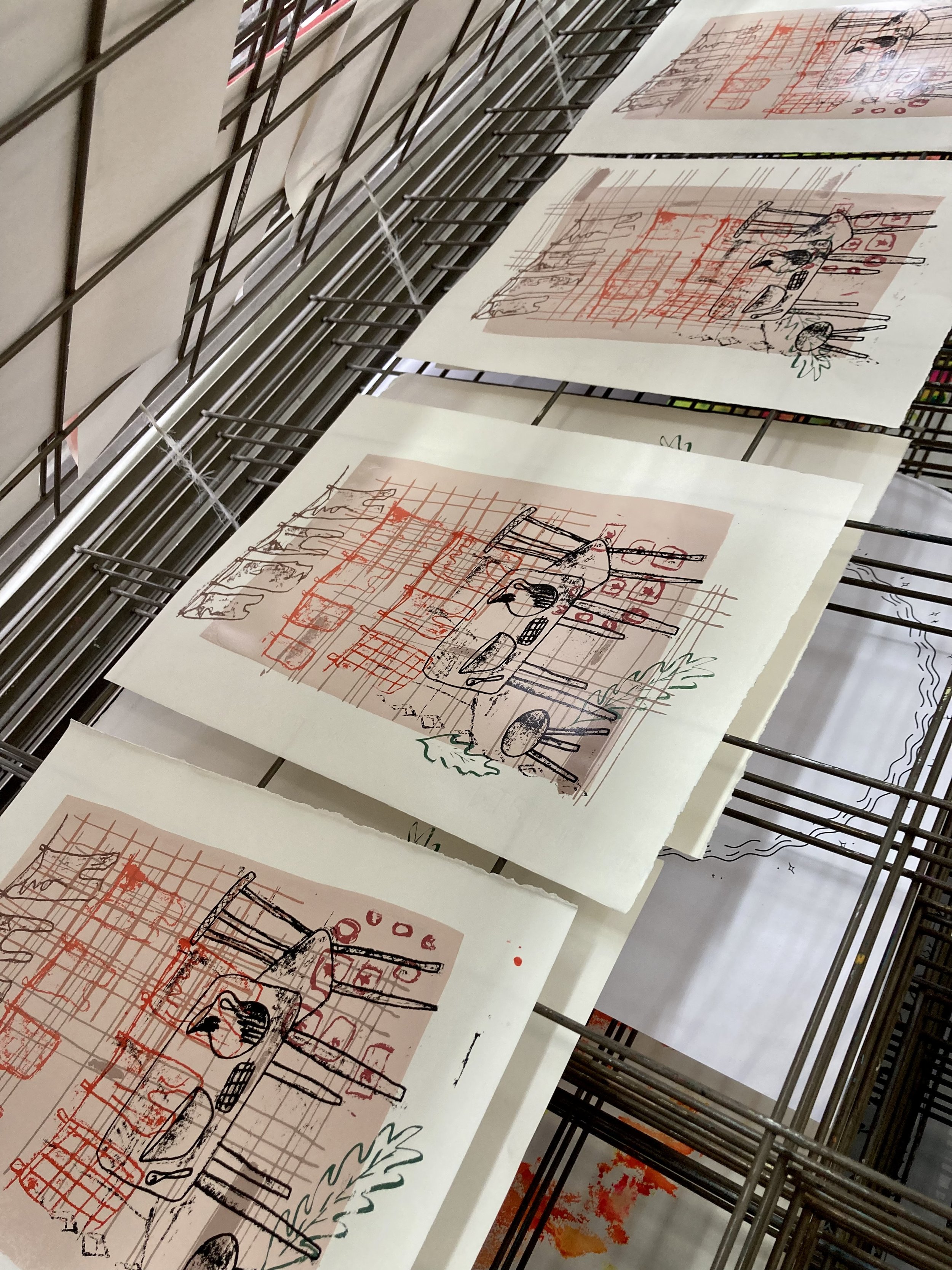
From this I sectioned off a large zinc plate and drew four images using litho crayon and ink washes. I then inked up and printed them individually. I added small elements of Chine-collé after building up the image.
Zinc lithograph plate, 76 X 51 CM

Lithograph prints on Fabriano paper, 21 X 29 CM

Zinc plate with chine-collé
Above is part of the series of lithograph prints that I then went on to exhibit in our Pop-up interim show at the end of the first term. I experimented with using some Chine-collé in the prints which acted well in adding colour to the prints and when viewed together, were helpful moments to create visual focus, moments to rest your eyes upon. However, working in sections on a large plate was not particularly successful as washing out the image after printing to do the next was awkward and challenging in not damaging the adjacent images. It would have been better to have done four smaller plates logistically and, having done one I would have realised the subtlety of the washes and would have used less diluted inks to create a stronger opacity to the image.

Lithograph prints with chine-collé on Fabriano paper, 21 X 29 CM

I had a tutorial with Paul where he asked me to consider the spaces in between the objects. From what I understand, he meant in terms of depth, shadow and perspective.
I was researching a lot into the work of Pierre Bonnard and in particular his drawings between 1893-1946. It is within these drawings that he creates an illusion of depth in his scribbled mark making. I was particularly drawn to his interior, still life scenes that often feature his wife, Marthe Bonnard and their dog, Basset.
I then tried working into my prints and it was whilst doing this that I started to think about the energy that exists between objects. How physical things can interact with one another and how they can be given meaning and can contain memories. I was lead again to Cornelia Parker and in particular her works Thirty Pieces of Silver, 1988-89 and Cold Dark Matter, An Exploded View, 1991.
This took me to thinking about absence and presence within objects and, through reading Avoided Object by Cornelia Parker, the importance of using objects that have a certain modesty or sentimental value. I was also intrigued by the notion of possessions continuing to exist without their original owner.
“So objects ares transformed by the presence of the believer, bereft of the believer they are bereft of meaning ”
Below are some experiments that I did using oil pastels. Filling in the blank spaces on some of my lithograph test prints that I had done onto newsprint paper was a way of illustrating the intangible energy that I believe is present within the subjects of the image. The fluid and rough mark making filling all the gaps within and between the objects, such as in the furniture, tiles, crockery and kitchen units, like a visual representation of all the particles rubbing along beside each other, with almost a buzzing, vibrating quality. It was here that I started to consider the notion of Stone Tape Theory and Psychometry and how it could be relevant to my work.
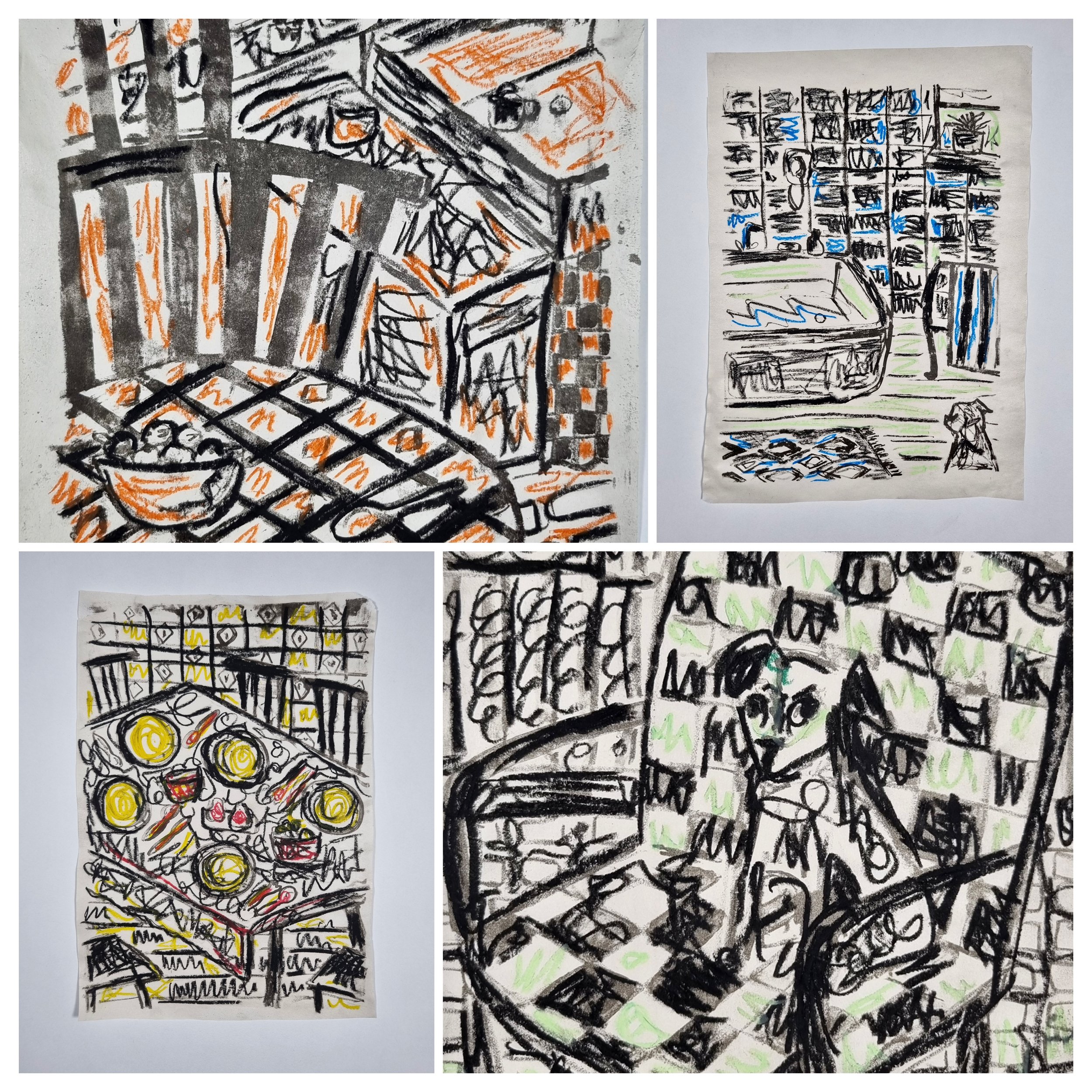
Zinc lithograph prints with oil pastel on newsprint paper, 21 X 30 CM
Stone Tape Theory and Psychometry
Stone Tape Theory is a speculative theory that events can be recorded in the form of energy onto objects. Similarly to tape recordings, such events can be replayed through the objects. Furthermore, with the idea being that ghosts are not spirits but recordings, it would in turn explain paranormal activity in which physical things are involved, as hauntings are played back through them. For example. If the walls and floors could remember the past and the trauma that occurred within them, then it could be argued that people may be able to sense, see or hear the past through them.
Stone Tape Theory is linked to Psychometry which is the claim that an object can have an energy field and that information about an object’s history can be emitted. These are both considered to be Extrasensory Perceptions, similarly to intuition, telepathy or second sight.
Stone Tape Theory became popularised after the BBC2 film The Stone Tape came out in 1972 and is mentioned repeatedly in the BBC Sounds series Uncanny.
Susan Hiller
I was particularly drawn to Susan Hiller’s pieces such as Painting Books & Painting Blocks 1972-84 where she reconfigures previously exhibited paintings to create new sculptural books. I like the idea that in reusing existing artworks, the newly formed objects inherently have a history. Some of her other works are examples of her use of cultural artefacts and the often overlooked with her work, such as Homage to Joseph Beuys, ongoing from 1969, which is a series of antique bottles of Holy Water collected around the world by the artist over the past 50 decades.
As I continued to research Susan Hiller towards the end of Unit 1, I got a greater understanding of her ideas surrounding the ‘paraconceptual’ and was fascinated by her interest in automatic writing. This relates directly with my study of Stone Tape Theory and Psychometry and I believe that it is her works surrounding these themes that I will continue into Unit 2 and explore in greater depth.

A view of the wall in my studio space, examining the interactions between the prints and the photographs.
I knew I wanted to exhibit a combination of this series of zinc lithograph prints and that the photos and text were important in how they were displayed. However, it wasn’t until our exhibition install with Dan Howard-Birt and a conversation that I had with him that I felt able to formulate how best to curate the piece.
Tracy Emin
I had previously studied Tracy Emin’s piece May Dodge, My Nan, 1963-93. Within this piece she pays tribute to her a grandmother and their relationship through framing and arranging small personal relics, such as a letter, photos and a paper doily.
This piece was first shown in her first solo exhibition, My Major Retrospective, 1993 at the White Cube where she arranged a great array of objects that she had collected, including personal diaries, toys and souvenirs.
I believe the way that she displayed the individual items together to create the piece May Dodge, My Nan, 1963-93 was an effective way of portraying her grandmother’s life and their relationship in a way that could be attributed to the relationship between many people and a loved one. A dialogue is created between the objects being displayed together and with the introducing a handwritten text, her own personal voice is woven through.

May Dodge, My Nan 1963-93, Tracy Emin. Image taken from the Tate website.
With this in mind, I worked out how best to display my piece for the show. By combining the prints with some of the photos and a short piece of text rather that individual headings, a dialogue was being created. I was anxious about trying to illustrate quiet moments of modest domesticity through subtle lithograph prints with little colour amongst a room full of other artworks by my peers. Mostly brightly coloured, bolder or larger, I was concerned that my work would disappear and appear ‘twee’. Dan encouraged me not to be afraid of sentimentality and to experiment with how I was going to display the pieces together.

Something must’ve been there
a speculation that,
events can be projected
recorded as energy
onto objects continuing to exist. Can you see the people walking by?
Accompanying handwritten text at the top of the piece
I believe that in displaying the piece in this way it encouraged the viewer to be reflective. In arranging the prints in a circular format it was asking you to look up, to look back and then with the text asking you to reflect again. I also chose to display the photos flat to the wall and the prints coming away from the wall on a nail so that they appeared slightly suspended but also firmly secure.
I had positive feed back from Dan and from my peers where they questioned who was in the photos, who was in the prints I had created and what decade they were from. These were exactly the questions that I was hoping would be drawn from my studies of absence and presence. They felt the combination was asking whether there was a relationship between the imagery and that this left them able to relate to the moments without having personally lived them. Although I would’ve liked to have continued to work on my prints and even to have made more to go within the series, I felt confident in what I ended up showing and am excited to see where further exploration in Unit 2 will take me.

Photo taken of my piece in our Pop Up show
Unit 2
As we embark on Unit 2, my aim is to continue my exploration with emphasis on examining the energy that exists within domestic spaces and the objects that inhabit predominantly through storytelling. Theoretically, I will explore the ‘paraconceptual’, Psychometry and Stone Tape Theory. After presenting our websites at the beginning of the second term I realised that I had not explained my thoughts clearly enough and had been placing too much emphasis on objects as individual entities, as if in a ‘still life’ arrangement. Rather, my interest being in how grief, loss, memory and hauntings can surround us within domestic environments and the objects that exist within them, significantly those which have previously belonged to someone else.
Through drawing, printmaking, the addition of text and perhaps sound pieces,I will continue to develop my practice over the course of Unit 2.